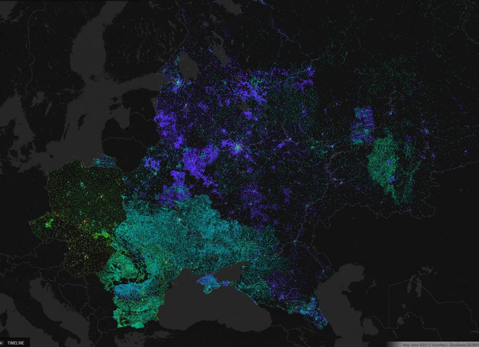
Mapping Wikipedia shows how the geographic coverage of the encyclopdia has developed for over time for each language edition. The animations below represent the process both as a cumulative distribution and moving timeframe. Articles are displayed at the moment the initial stub was created.
Geographic coverage by language
The following videos show how the geographic coverage of articles for English, French and Arabic accumulated over time.
At the time of writing the English edition was the largest and most developed, with over 700,000 geolocated articles. In some regions the density mirrors population, however many places with large populations are barely represented, whilst parts of Antarctica are densely covered with articles. Not all articles were created by human contributors in person. It is possible to see which article stubs are likely to have been created by bots or automated processes, injecting basic data for locations from public domain sources, as is the case with the Antarctica data. Bot generated stubs tend to appear all at once in large regional block. Displaying the article word counts gives an indication as to which articles have remained as stubs.
The French version of Wikipedia was created on or around 11 May 2001, with the Arabic version coming some time after.
At the time the project data was collated the French Wikipedia had a little over 220,000 articles while the Arabic version had around 24,000. Seen together it is clear how uneven the distribution of articles is across the different Wikipedia languages.
Language word count maps
The following three videos show English, French and Arabic again, this time with Word Count selected and a date range of four months. Articles appear when the stub is created and disappear again when the time slider no longer covers the creation date. This view lets us see the patterning of article production at specific times, without small changes being obscured by older articles as they are in the cumulative animations above.
English – word count, four month range
French – word count, four month range
Arabic – word count, four month range
Europe and North America
The five videos below all show English and French Wikipedia articles in North America and Europe. At this zoom level it is possible to observe geographical features described by the data; cities, transport infrastructure, and natural features like rivers and mountains.
Wikipedia articles in North America
In the following video of English in North America, mapped by density, you can see the accumulation of geo-referenced Wikipedia articles subtly describe features in the landscape. The articles appear to emanate from the cities and centres of population over time.
The video above shows English in North America again, but this time the metric is article creation date over a moving range of four months. Mapping article density highlights where large clusters of articles are present, whereas the creation date metric with a small date range makes it possible to pick out fine grain geographical features. The Winnipeg and Churchill train line appears at the end of 2009, and the mountain peaks on the British Columbia / Alberta border around 2010 (see 0.54 seconds in).
English language Wikipedia in Europe
Unlike the US density map above, the English map of Europe is so densely packed with articles in places like the UK, Israel and the Palestinian Territories that it is impossible to pick out cities. The mapped territory has definite edges: the area beyond them is much sparser, and east of Poland and Romania is a virtual terra incognita to English speaking Wikipedia.
English and French Wikipedia word count
In the English and French maps of Europe below, mapping article word count over a moving range of four months, we can see the rapid production of regional stubs, especially after 2006. The brighter light coloured dots indicate articles with a word count of over 1000, the darker red dots a word count of less than 250. The word count data is for the articles as they stood at the time, so those darker red articles had remained as stubs.
It is possible to compare these maps and see how the different languages shape the way that places are defined and imagined. These geo-linguistic contours can be seen temporally as they play out across the maps. In the French map the pilgrims’ route westwards to Santiago de Compostela in Spain appears from 2011 (see 0.46 seconds in), but does not appear in the English map.

Created: 2012